Showing posts with label purple. Show all posts

Wednesday, May 6, 2015

Hawaiian Skittle - OPI Lost My Bikini In Molokini & That’s Hula-rious

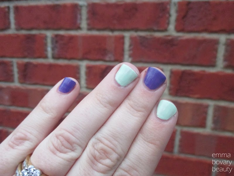
I was so excited about the new OPI Hawaii collection that I decided to start off my swatch-fest with not one, but two of the shades contained in the mini-pack! I've always loved a purple and green combination but it isn't the easiest to incorporate into a makeup look (though I am tempted to try it out now) so I was excited to put these together for this little skittle mani. Loving the Hawaiian daydreams ;)
Lost My Bikini in Molokini* is a stunning mid-tone violet creme, and I'm happy to note that I don't have anything like it in my nail polish collection. It was a dream to apply, needing only two coats for opaque coverage and even on my unkempt and stubby nails I think it's a good looking polish. It's a purple with a bit of an edge, which is just the way I like my purples most of the time. It's definitely one of the nicer shades from the tropical-inspired release, some of them were actually quite dubious like the frosty yellow Pineapples Have Peelings Too! which you can see over at All Lacquered Up.

That's Hula-rious* is a pale peppermint crème that needed quite a few coats to become opaque - I think it took 4 thin coats before I was content with how the shade looked on my nails and all of the bald patches were eradicated. I think that multiples coats are common with pale shades like this though - it definitely has been in the past for me! I can appreciate a peppermint/mint shade like this, but don't think it's a colour that would be worn frequently on my tips as I tend to favour deep and moody shades, or very bright ones!
 
Overall I'm quite pleased with my OPI Hawaiian adventure thus far - if only wearing the shades would really take me back to the islands *swoon* Next up will probably be the mouth-watering Aloha from Hawaii*, so stay tuned!
 
-Emma
 
*Provided for consideration. Honesty, always.

Tuesday, December 17, 2013

Loving Right Now // The New, The Old and The Reliable

Bought myself the newly released Savvy blushes a while back, and inserted them into my daily routine without a second thought. The shades aren't crazily pigmented so they are quite easy to apply, which tempts me to buy them all for Mumma Bovary as well and expand her blush shade repertoire... The pictured shade is Plum, which is purple-toned enough to be exciting but also ties in nicely with most eye looks. Lately I've been alternating between a dark eye or a shimmery champagne, gravitating towards Dior Fairy Golds more often than not if truth be told.
When I haven't been rocking Dior, ye olde faithful MAC shadow in Jaunty makes an appearance. Stupidly limited edition (Hey Sailor collection, 2013) I don't feel bad about mentioning this absolute stunner as I feel I am simply preparing you for the day it is rereleased, and then you can all rush out and buy a pan. But save me one for a back up, okay?
 
Fulfilling the reliable quota for this post is the stunning Revlon Super Lustrous lipgloss in Pango Peach. It's become the go-to gloss shade now that I'm scared of the hot Melbourne sun melting my lippies, and it is super flattering with pretty much every eye look you can think of. Plus it is a favourite of Jess from The Belle Lumiere, so you just know it is a winner.
 
What products are you loving right now? Tell me what blush you have on today!

Emma @ emmabovarybeauty


Wednesday, November 27, 2013

Pushing into Purple

Do you have one of those colours that you just never reach for? I think green and blue are quite elusive eye shadow shades for most people I know, though personally I love a good navy for my smoky eye and am not afraid of a little pale blue on the eyes if it is anchored down with some eyeliner! 
 
The elusive shade for me? Purple! While I can definitely see the appeal and think that it is a pretty colour, I just find it needs more effort to look good on me than other colours. I have had some success with some lilac and violet shades though, as evidenced by the things I've rounded up to play with here.
 The Colour Theory palette in Verry Berry (not a fan of the name...) is really pretty and I'm totally loving that brand at the moment. A shadow duo I am yet to try is the Nars duo in Marie-Galante which I tend to just take out and stare at rather than actually use. I think Taylor Swift Wonderstruck rollerball fell into this image because I am interested in the new scent she has out, I think all of her fragrances are really lovely.
 
Purple lips totally remind me of Angela from One Skim Mocha Please who I just adore, and my brave lip choice is MAC Sheen Supreme in Asian Flower, which is ultra glossy and a beautiful lilac shade. For a deeper and more wearable purple lip I turn to the Covergirl Jumbo Gloss Balm in 260 Plum Twist*. 
 
I have a lot of fun playing with colours despite them sometimes being a bit daunting - that is what makeup is all about, right?
What colour do you find hard to wear?
 
Emma @ emmabovarybeauty 

Monday, May 27, 2013

Get Pompous in 60 Seconds with Rimmel London


Sometimes I just get gripped by the thought of a new polish, and the obsession won’t leave until the shade has coated my tips. I was hauling at Chemist Warehouse’s infamous 50% off sale when I spotted Rimmel’s Pompous at the checkout. Rather than go down the sensible route and just tack it onto my order, I told myself I never wear purple polishes and moved along. In my spare moments during the week I kept thinking about the multi coloured shimmers in the purple base, and succumbed to the pressure before work one night and set out to hunt it down.


After seeing the Pompous spot empty at Priceline (where Rimmel polishes were 2 for $10) and on the My Chemist shelf (where Rimmel was 50% off!) I managed to snare a bottle for the lovely price of $3.98 (usually $7.95) from the other My Chemist in the area, right by my work! I was elated at my purchase, and love the way that this applies and looks on the nails. I really need to love a purple shade for it to make it onto my nails, and this hasn’t disappointed. I definitely prefer the deep and glossy complexity that a top coats adds to this colour (Seche Vite, for example) as I tried a thinner top coat and (the Skin Food pictured below) it just didn’t have the same appeal.

 
Have you ever become obsessed with the thought of owning a beauty product? What lengths have you gone to in order to track it down?


*Purchased by me, and the Skin Food top coat was a much appreciated CP from the stunning Emily Quak from Emily’s Anthology. Thanks Emily!

Tuesday, January 29, 2013

Raindrop Nail Art // Bright Purple and Turquoise

 
I was obviously feeling creative the morning I topped my nails with this little raindrop-esque number. I am the first to admit that nail art is not my strong suit, and though I had a dig around in the nail stash my ebay nail dotting tools remain AWOL. I used a humble toothpick to play around with the turquoise BYS Blue N283 atop the stunning Ulta3 Spring Break.
 
 
Ideally this would’ve been a dotty manicure, but when I saw the finished product raindrops came to mind, and I thought it quite ironic considering how toasty it is down in Australia at the moment. I’ve been thinking about how amazing it would be to visit my family in Scotland and experience snow for the first time in my life. I think the next time I’ll be close to managing that will be my honeymoon, but sadly I doubt it will be snowing then. Raining, probably!


You can buy BYS polishes from Fashion Addict here!

I am sliding right into a purple phase right now, so Spring Break is right on target and will be getting much love in the Bovary residence. What else do you think I should do with it?
 
*The BYS polish was borrowed from my MIL and the Ulta3 shade was purchased by me. Honesty, always.

Monday, December 3, 2012

Watt's Up. Freshly Candy?

 
A sunny day calls for some pretty makeup, and this is what came out of my makeup drawer. 
 
I decided to go for a pretty pink lipstick that was one of the first lipsticks I ever chose (and was recommended by Zoe Foster) the stunning L’Oreal Colour Riche in Freshly Candy. I’ve since snapped this poor little thing, and it is in my drawer with the other broken lippies waiting to be mended. I paired it with Benefit’s Hervana, which when swirled together is a pale pink flush that isn’t my favourite, but goes with a lot of looks and so is still worth a spot in my collection.
 
Benefit’s Watt's Up* is one of the best highlighters I own, and the colour is pretty much perfection. I went for one of my favourite eye shadow palettes for my eyes, No.7’s purple smoky palette (bought in Thailand from Boots) I also popped some of my L’Occitane Pivoine Délicate Roll-On & Gloss Duo* on top of my lipstick. The duo roll on is great for perfume touch ups and for adding a bit of pale pink shine to my pout. I’ve swatched both below for you.


The No.7 palette  isn’t super pigmented, which isn’t too bad because it means it helps me create a subtle eye look. It is something I hardly do, and I must admit I’ve been enjoying it.

What do you think of subtle eye looks? Do you tend to play up your eyes, cheeks or lips most often?
 

Thursday, November 15, 2012

Vamp Nails // Alice Had a Vision-Again // essence Twilight BreakingDawn Part Two


I picked up all four essence Twilight nail shades (as I mentioned in this haul) and thefirst one I chose to do a full mani with was Alice Had a Vision-Again. A blackbased filled with purple flecks and the odd aqua fleck as well, this is reallydark but shines purple when it hits the light. The flecks seem embedded in thenail and spread really evenly when painting it on, which made this a reallyeasy polish to work with.


I’ve also snuck some sneaky Dior holiday swatches into that last image, just in case you thought my hands were dirty. I’m tossingup between the two quints at the moment, and just can’t decide!
 

I really like the deep vampy purple of Alice Had aVision-Again and the flecks of aqua and purple are particularly beautiful indirect sunlight. I would recommend all of the new essence Twilight shades, eventhough I’m not a big Twilight fan the colours are gorgeous.

Are you going to watch the new Twilight film?
What new holiday collections are you lemming?

Tuesday, October 23, 2012

Moth Brown - MAC By Request // Swatches, Face of the Day

I have only been a beauty lover for a few short years, so when the MAC By Request idea was announced on Temptalia here, I had not owned or swatched any of the mentioned shades. I thought they were nice, but I was not taken with any shade in particular until Jessica from Getting Cheeky showcased the shade Moth Brown here.
Moth Brown is described on Temptalia as a purple tinted shimmery grey, and I would say so also, but note that it leans taupe and brown as well. It is much more purple than something like Satin Taupe, and I don't own anything else like it.


Moth Brown swatches smoothly and the pigment is easy to sheer out, but equally easy to build up for a darker, more dramatic look. Though it is a frost finish, I find it quite satin in finish.


I chose not to sheer Moth Brown out too much, and vamp it up with a deeper lip shade as well. I like the overall effect, and though Moth Brown can easily be an everyday taupe shade, I like that I can use it for a deeper night time sort of look also.
 
 
Face:
Face of Australia Face Base primer
Clinique Repairwear Laser Focus foundation*
Illamasqua blush in Hussy
 
Eyes:
MAC paint pot in Painterly
MAC Moth Brown eyeshadow
Laura Mercier Pale Pink eyeshadow to highlight
Revlon Grow Luscious Mascara in Black Shimmer
 
Lips:
YSL Rouge Pur Couture Vernis à Lèvres in #4 Mauve Pigmente
 
Hair:
Toni & Guy Dry Shampoo for volume*
 
Moth Brown is limited edition and is $33 AUD here.
 
What are your thoughts on 'request' collections?
What discontinued products would you vote for?
What do you think of this shadow?
 
*I purchased this myself. Honesty, always.

Tuesday, September 25, 2012

An Enchanted Eye Look // ft Clarins Enchanted Palette

I've been so obsessed with palettes lately, I love being able to create a whole look with one palette open in front of me. It saves space in my 'daily face' bag and when palettes are well put together is it generally easy to put together a flattering look. To put this look together I used the Clarins Enchanted Colour Quartet & Liner palette featured in yesterdays post.
I used the golden and purple shade on my lower lashline, and I must say I love the effect. It adds some colour to a look without being too over the top. I've been wearing the golden shade on my inner lower lashline with a lot of my neutral looks to work, I feel like it really brightens my face up!
On the lids is the golden bronze shade, and blended out some of the shimmery chocolate shade on the outer third. It's a subtle look, but the sheen makes it something special. To highlight, I used the palest shade from the palette. Of all of the shades in the Clarins Enchanted palette, the pale champagne shade is the least impressive. I have similar shades in my collection which are a smoother texture and have better colour payoff, but I'm still glad that it is included in the palette to have a highlighter option close at hand.
What do you think of these colours on the lower lashline?
Do you think this look is enchanting?
 
*This palette was provided for consideration for review. Honesty, always.

Monday, September 24, 2012

Clarins Enchanted Colour Quartet and Liner Palette // Swatches, Review, Photos

Clarins have taken inspiration from traditional Indian sari's for their new Enchanted collection, and seeing the eyeshadow palette design for the first time truly impressed me.
The outer casing has beautiful detail on it, matching the prints on the shadows themselves which I found to be a lovely touch.
One thing I don't covet is the inclusion of miniature brushes- many companies do this, and I know a lot of consumers would prefer a slimmer palette as they have brushes they prefer using in their collection already. Some may like to have these on hand though, it is just personal preference. The mirror is definitely a great inclusion,even if it is never used it is always handy to have an extra mirror around!
As you can see from my swatches the shadows are not incredibly vibrant, which I think lends to them being easy to work with and once they are on the eye, they are really nice and give enough colour. This palette is an example of something really beautiful, but also something you could get use from at work and on weekends- a win win purchase really!
The sheen of the golden shade from this palette is outstanding, I've been regularly wearing this on my inner lower lashline to add a bit of oomph to my looks, even when the look isn't created with other colours from this palette. Although the purple is sheer in swatches, it is so good for a lower lashline colour, ever since my Kit Cosmetics makeover I've been searching for this and now I'm content.
The shadows are quite shimmery and give a nice glow to the lids, though they are much sheerer than palettes I normally go for. I have a face of the day coming up tomorrow so do be sure to check that out. I haven't really delved into the deep chocolate liner in the palette yet, but that purple and gold have really taken a hiding over the past month!
 
The Clarins Enchanted palette retails for $55 AUD and is available from Myer, David Jones and Adore Beauty.
 
Do you find it hard to dip into beautiful palettes like this?
Have you tried Clarins makeup before?
 
 
*This product was provided for consideration for review. Honesty, always.
 
Related Posts Plugin for WordPress, Blogger...